A Guide to Visual Merchandising
.jpg)
Drawing the attention of potential customers to your products and into retail stores can be an ongoing battle, particularly in industries where competition is rife! However, there is a very handy technique that you can add to your toolkit to help your company rise to this challenge - and that’s strong visual merchandising.
Visual merchandising principles allow you to position your products incredibly effectively - both in your real-world premises and in the minds of your customers. They don’t just make individual items appear more attractive; they can also tempt visitors to spend longer in a store, potentially causing a rise in impulse purchases and returning customers!
But what exactly is visual merchandising? What are the strategies and design methods involved - and how can you harness it to improve the performance of your brand? Below, our retail space designers at Ripple answer these questions.
What is visual merchandising?
Using opportunities presented by the physical space within (and outside) your premises, a good visual merchandising strategy expertly guides each customer’s attention to your products.
It’s a form of marketing that takes visitors on a journey around your store, presenting each item in its best light and displaying its practical benefits and aesthetic appeal.
While it sounds simple, good visual merchandising involves strong strategic planning and the application of a number of key elements to achieve the best results.
What are the key elements of visual merchandising?
The basics of visual merchandising boil down to these five elements:
- Use of space. Make sure your products aren’t crowded - and that the space you give them draws the right amount of attention each time.
- Focal points. With each display area you put together, you’ll need to decide where you want a visitor’s eyes to be drawn. You shouldn’t have too many focal points close together, as this can divide the audience’s attention and ruin the effect.
- Position. You’ll need to think about how items are placed; in relation to one another, the store’s layout and the “customer journey”.
- Lighting. While brighter lights are great for bringing out detail and making spaces feel bold and energetic, lower light can give a sense of intimacy and luxury. Alternatively, you could combine the two, picking out certain products with areas of stronger light and using techniques like up or downlighting to provide atmosphere.
- Colour scheme. Your use of colour and pattern should always reflect your branding. There are no specific rules here, but pops of colour against more muted backgrounds will always create a strong focal point, while the opposing forces of minimalism and maximalism can both delineate luxury when used correctly - as can monochromatic design.
What is the difference between visual merchandising and display?
While visual merchandising and display are extremely closely related, there are key differences.
Simply put, display is just one of the many elements that goes into a visual merchandising strategy. It involves the carefully considered placement of an item or group of items to create a strong sense of engagement and appeal.
Visual merchandising, on the other hand, combines well-designed combinations of physical displays with a well-crafted look, feel and layout of a store to create a cohesive and attractive customer experience, promoting the quality and identity of the brand.
Types of fixtures and displays used in visual merchandising
Visual merchandising displays are extremely useful when planning out the aesthetics and layout of a store.
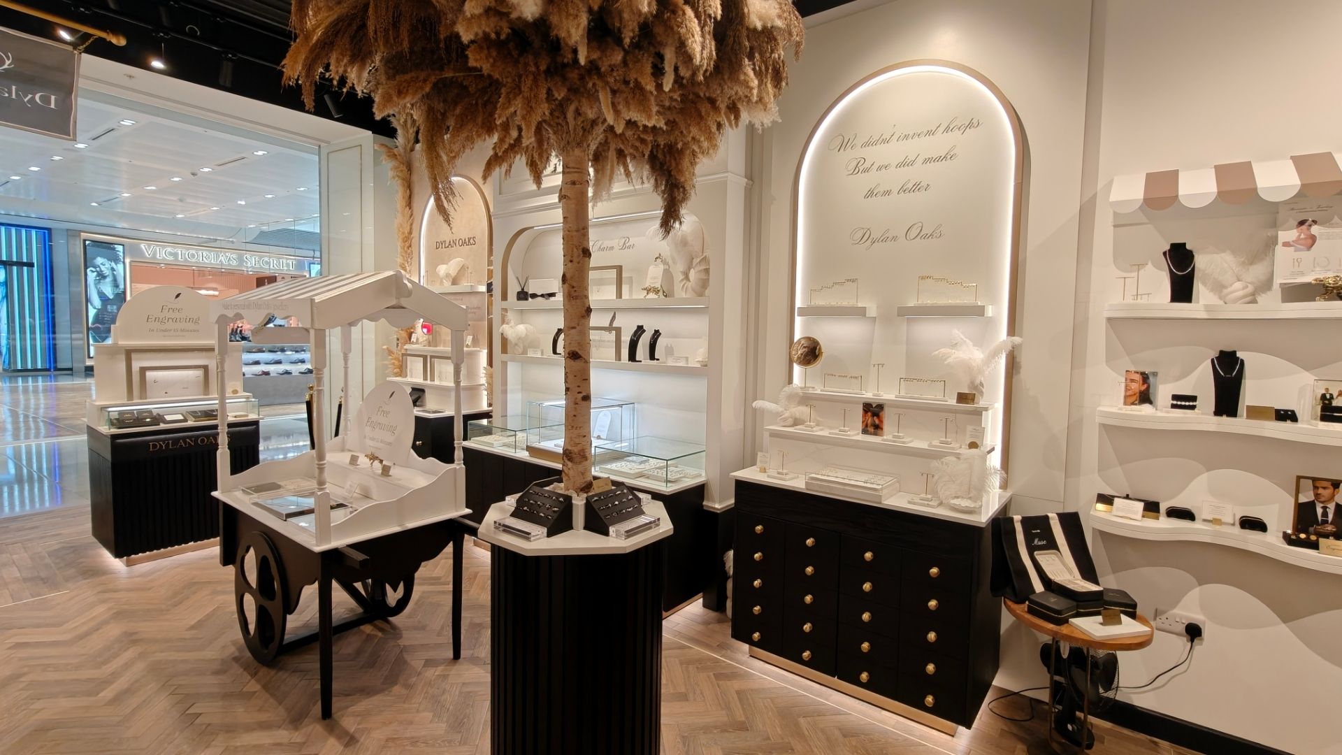
Our designers at Ripple like to employ combinations of the following for a dynamic and appealing space, using different levels and contrasting or complementary arrangements to create the perfect setup each time.
Window display
It’s very important to invest in your stores’ window displays. Like a house’s curb appeal, it offers a vital first impression of your brand and - if you’ve done it right - will effectively entice future customers inside.
Shelves, Racks and Rails
These elements can be primed to show off your products at their best, making them as attractive as possible to those passing.
The angle and positioning of items on a shelf, rack or rail can be managed in a unique and dynamic way, drawing in customers and keeping their attention.
Free Standing Display Units
These stand-alone units can be placed at the end of shelf-rows, within sight of a store entrance to offer a tempting glimpse to those outside, on the approach to the tills, in interesting arrangements as a focal point in the centre of the store - basically, wherever you want them!
Because of their versatility and the fact that they are unfixed, FSDU’s offer a great way to boost the visibility of certain products, improve the flow of premises and add unique touches wherever required.
Point of Purchase and Point of Sale Units
These types of displays include a range of options, like countertop displays, dump bins and end caps - plus, free standing units can also fall into this category depending on their positioning and intended purpose.
Point of purchase and point of sale displays are a great way to encourage visitors to interact with your products, pick them up, try them out (if permitted) and generally explore. They’re also a great way to influence impulse purchasing.
With countertop displays regularly placed near to tills, this journey could not be quicker or more straightforward.
Digital displays
Blend digital with physical by including touchscreen displays in your premises. This can help to give the customer an idea of the wide range of options available to them without having to sacrifice valuable floor space - and can also offer a highly attractive tactile feature.
If you make online orders possible from within your store, this could even boost conversions.
Top Tips for successful visual merchandising
Here are 10 of our favourite visual merchandising tips to help you choose your very own approach:
1. Your strategy must always adhere to your brand’s identity. Everything from the use of colour to a visitor’s journey around your space should reflect the impression you want to give as a company.
2. Your store’s interior should be regularly refreshed and updated. Many brands do this seasonally. This keeps things interesting and retains consumer attention in the long run.
3. Keep your store neat and clean! Dusty shelves, fingerprints on glass and disordered items can be extremely off-putting. If you take demonstrable pride in the way your store looks, consumers will be more likely to believe in the quality of the things you sell.
4. Think about the placement of different product types within your premises. Ideally, items that are to be used together, that fall into the same category, that come as part of a set or that are often bought together should be displayed near to one another in a dynamic way.
5. Consider customer behaviour. Many leading visual merchandisers collect data on their audience’s preferences and decision-making styles to inform their store’s layout. Doing this will help you implement a visual merchandising method that appeals to the right people.
6. Make sure that the customer’s physical journey around your store is straightforward and easy to navigate. This should be as intuitive as possible, but using clear and attractive signage can often be very helpful.
7. Remember: all the senses should be considered. You should also think about using sound, as the music you play should clearly reflect the tastes of your target audience or the image you want to convey.
“Try-me” opportunities can give a fantastic tactile experience, and, if you sell food, it may also be possible to offer samples in order to appeal to the sense of taste.
You could even use specific scents - perhaps the smell of a food you sell, or a perfume, or you could simply invest in an appealing commercial air freshener.
8. Explore symmetry (or attractive asymmetry) and the use of either complementary or contrasting colours to draw visitors’ eyes to every major focal point.
9. Don’t crowd your products: give them the space they need to stand out. The use of minimalism and white space is extremely powerful in visual merchandising.
10. Tie it all together. Everything in your premises, including your display methods, should make sense both as a reflection of your brand and as an intuitive, practical response to your audience’s requirements.
For further guidance on visual merchandising and to explore the bespoke display and showroom design services offered by the team at Ripple, don’t hesitate to get in touch with us today. We will be more than happy to discuss your aims and work with you to develop the best possible visual merchandising strategy.
More from the Retail Journal
Reach Us
Let’s start the conversation.

Greater Manchester OL4 2AB


.svg)
.svg)
.svg)
.svg)


