Perfume displays don’t suffer from a lack of creativity. They suffer from a lack of strategy.
At Ripple, we’ve seen it all.
Across beautifully lit counters no one stops at, to elaborate brand zones that fail to guide a single purchase. When you’re working with compact products, high margins, and an overload of choice, a display has to do more than look the part. It has to perform.
That’s where we come in.
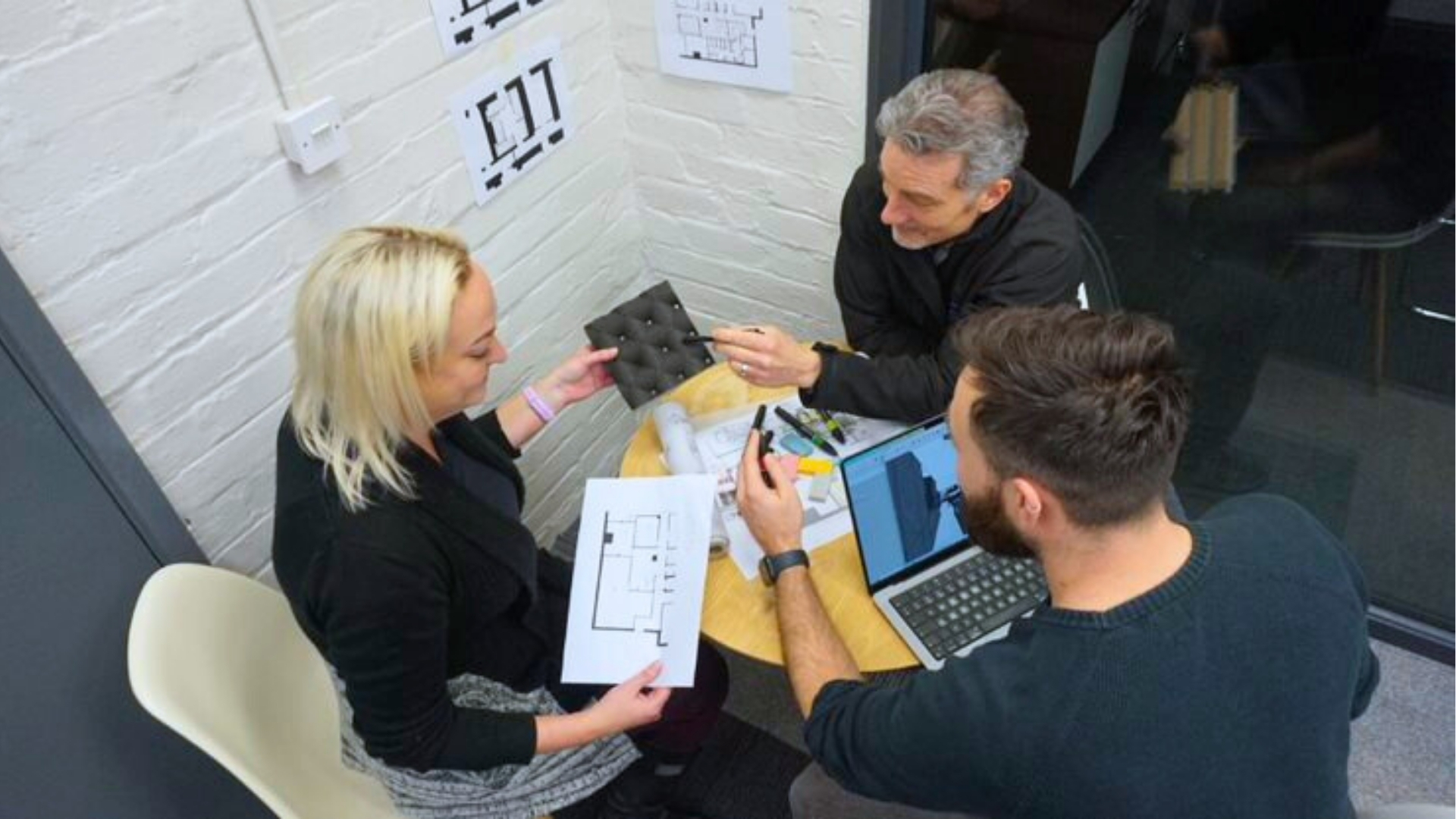
As a team of expert retail designers, Ripple rethinks fragrance displays using principles of psychology, design, and deep retail experience to build spaces that feel luxurious, intuitive, and commercially sharp.
Form Follows Feeling: Designing for the Customer Journey
We often start with this question:
How do you want your customer to feel?
Relaxed? Curious? Decisive?
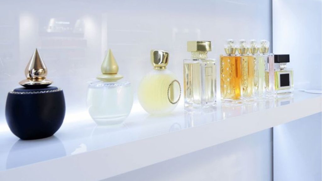
The layout, flow, and zoning of your fragrance area should build that emotional arc. Scent can be overwhelming and too many choices, no clear entry point, and cluttered counters are a fast track to decision fatigue.
That’s why we favor zoning by scent profile (citrus, floral, woody) rather than brand.
By swapping trend-led design with neuroscience, your new perfume retail design will guide customers to shop for scent based on mood, memory and taste.
Grouping products this way even encourages browsing, story-building and cross-brand discovery.
This approach also echoes findings in behavioral science: a well-known study showed that people were significantly more likely to make a purchase when offered six options compared to 24, even though larger assortments initially drew more attention. [Source Link Springer]
In short, less is often more persuasive…
Smart detail: We’ve even layered in gentle colour washes, soft diffusion, or low-key lighting shifts to subconsciously guide customers without a single word of signage.
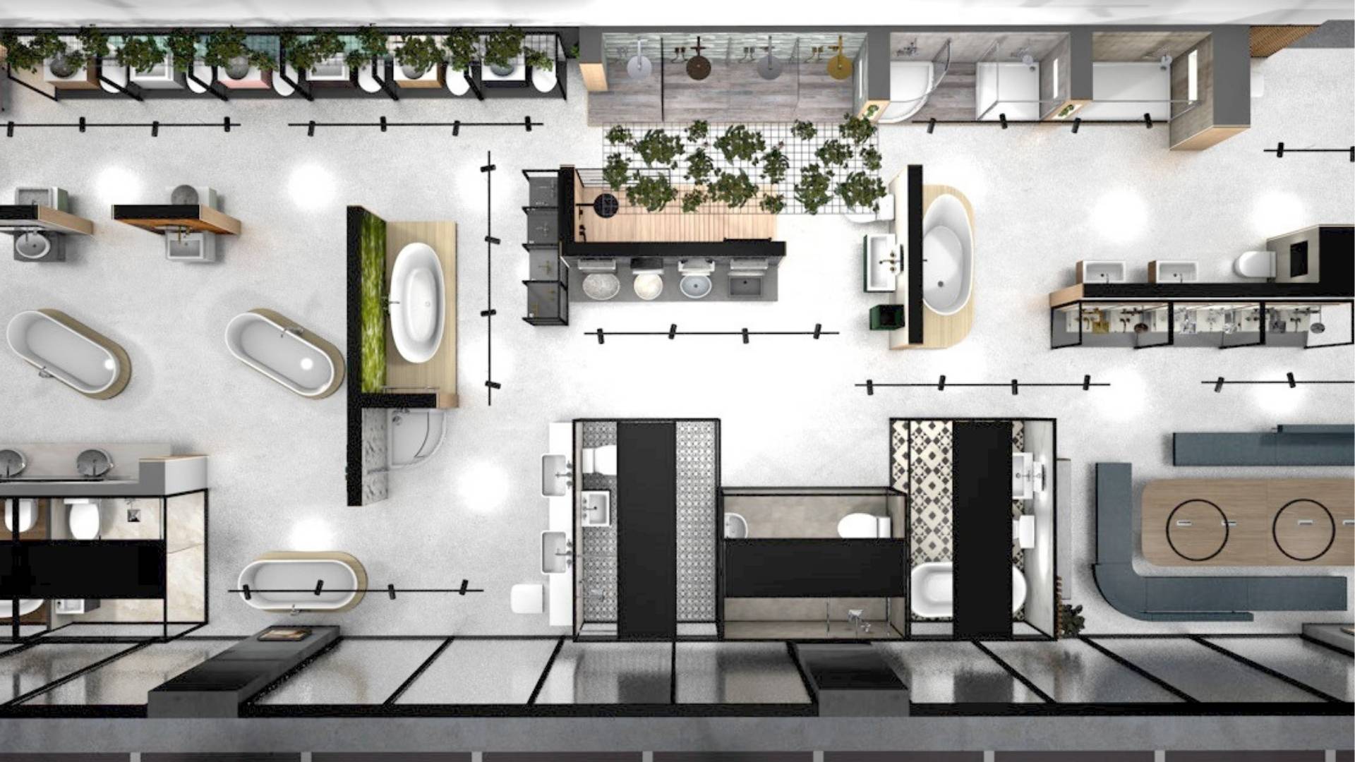
Tiered, Tactile, Testable: Displays That Invite Interaction
Fragrance sells best when experienced.
But if a customer doesn’t feel confident picking up a bottle, or can’t find the tester? You’ve lost them.
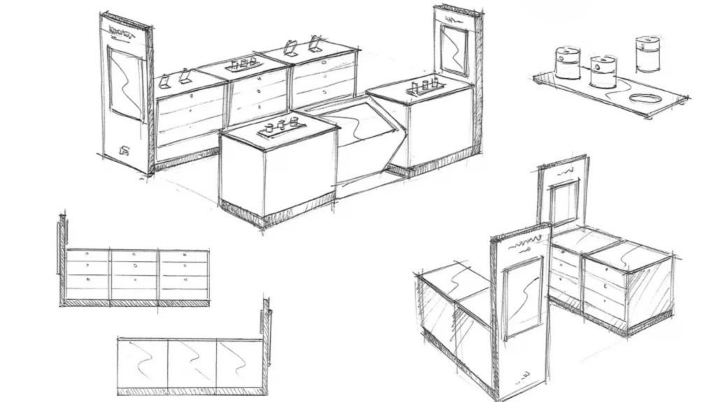
We design tiered countertop displays that create physical invitation. Tiering brings visual hierarchy, but we combine this with tactile elements: grippable testers, intuitive tray systems, and integrated prompts (think QR codes or simple callouts) that give customers permission to explore.
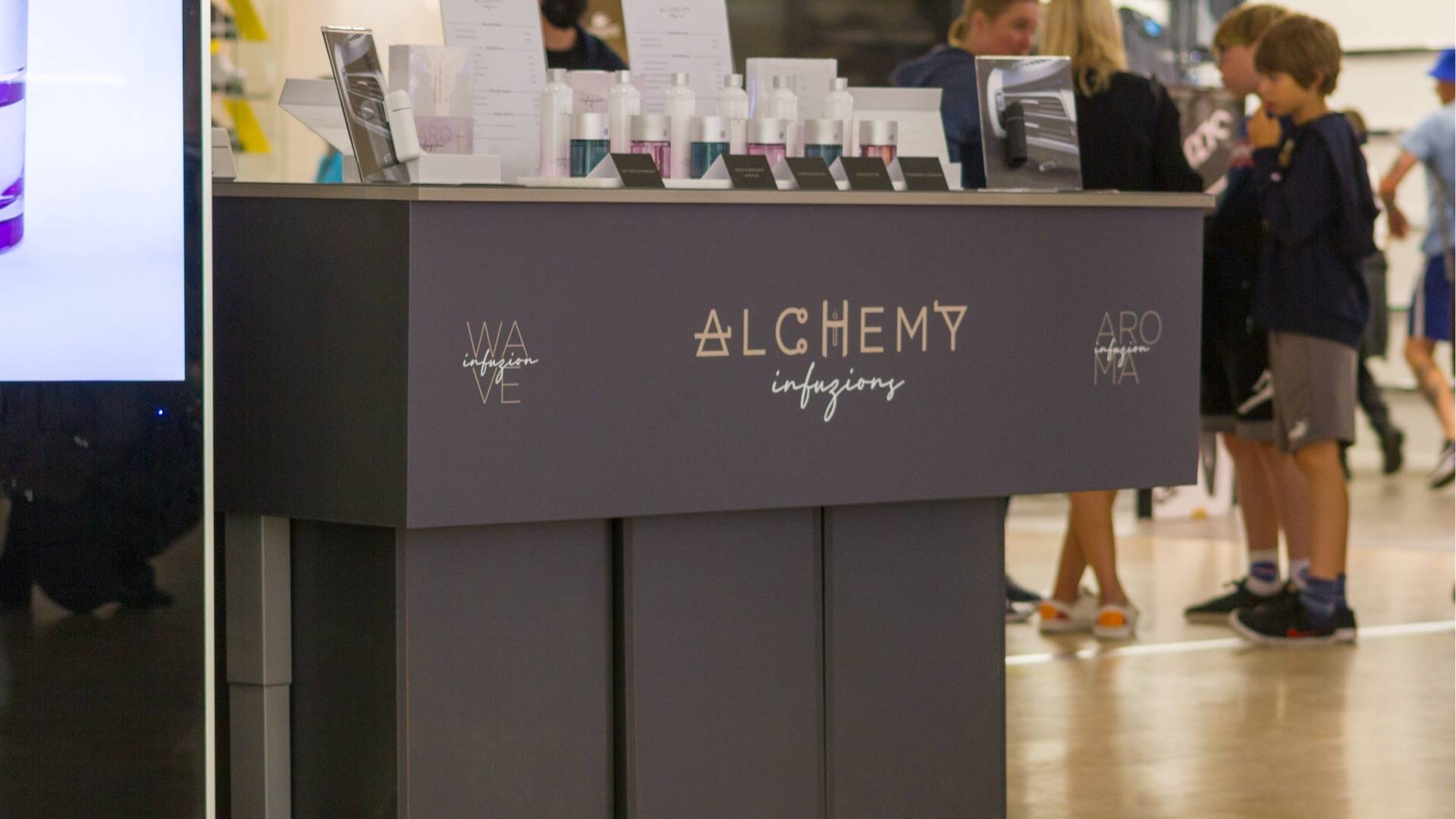
Example: Alchemy Infuzions
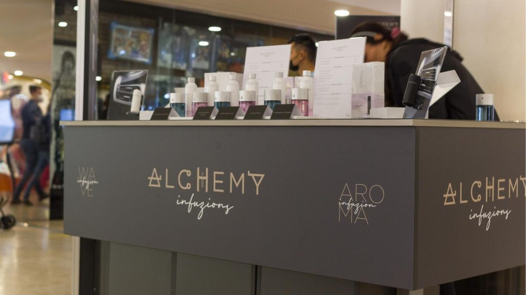
For Alchemy Infuzions we embedded test-and-learn zones directly into their display units – frictionless for staff, intuitive for customers.
The result? Higher engagement, deeper customer feedback, and a delighted client:
“Truly outstanding, they worked with us in partnership to create the very best solution for our budget and the finished product has blown us away!” Lising Mo, MD, Alchemy Infuzions
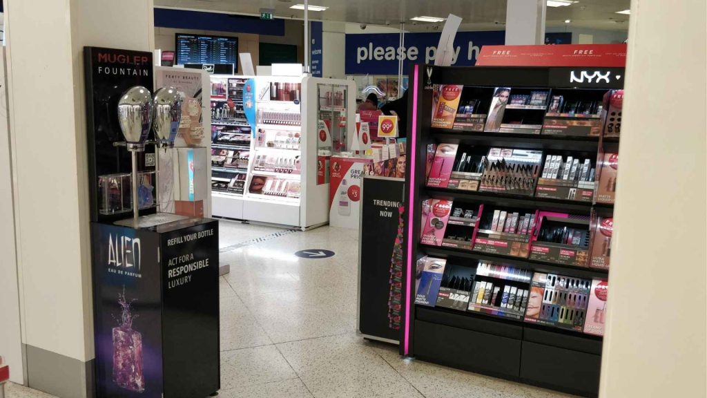
Example: Mugler Refill Rollout
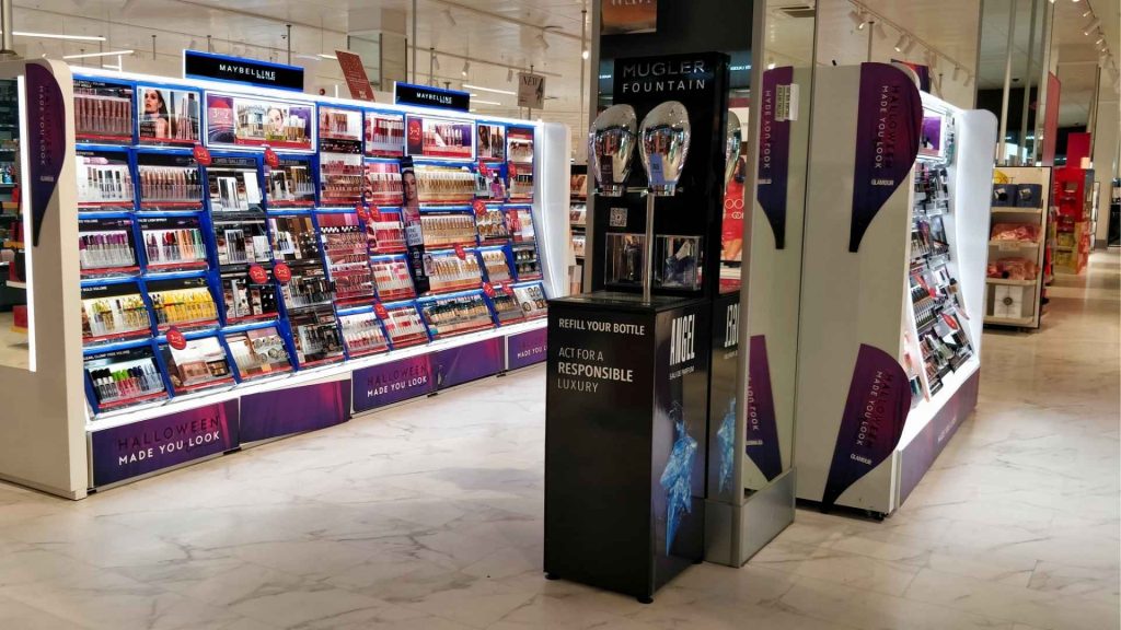
Ripple’s refill fountain design for Mugler was rolled out across 150 Boots stores nationwide. The initiative has saved over 107 tons of glass and today, one bottle is refilled every 18 seconds somewhere in the world.
That’s the power of pairing practical function with elevated design – beautiful enough to attract attention, intuitive enough to drive action.
The result? Better engagement, and far richer feedback.
Light Isn’t Decoration – It’s Direction
Lighting is one of the most misunderstood elements in fragrance display.
Done wrong, it flattens packaging and dulls the product’s allure. Done right, it elevates every detail and guides the eye through the space.
At Ripple, we learnt this the hard way.
In the early days, we created a stunning 3D render for a display concept using standout lighting effects. But when it came to prototyping, we realised the spacing needed for cable runs and LED fittings meant we couldn’t replicate the look exactly. That was our lesson: lighting can’t be an afterthought.
Now, we engineer it into the design, from day one.
Our designs choreograph lighting deliberately – cool tones for fresh scenes, warmer hues for masks and ouds, undershelf glows to lift glass bottles, and spotlighting for hero SKUs. These aren’t just visual effects, they align with product feel and guide the customer’s eye and journey.
Ripple tip: Always consider where shadows fall. We’ve redesigned entire shelving units just to avoid awkward shadow lines across key products.
Refill That Feels Premium: Sustainable Can Be Luxurious
Refill stations used to scream “functional.” That’s no longer good enough. Sustainability is becoming a core part of brand identity and customers expect it to look as good as it feels.
Take our work with Mugler.
The brief? Build a refill experience that matches the brand’s aspirational feel.
We used polished surfaces and carefully selected materials that aligned with the scent itself. Storage, messaging, and interaction were all integrated instead of simply bolted on.
The result? Repeat visits went up. And customers started photographing the refill station. That’s design that performs
Experimental Design in Action: Psychology and Play
The most powerful displays often don’t show you what to do – they nudge you there.
Ripple uses experimental retail design to draw on environmental psychology, sensory cues, and behavioral science to create immersive brand moments:
- Material psychology – Brushed metal feels modern and gender-neutral. Natural wood brings warmth to citrus or floral scents. Every material decision carries a message.
- Scent and sound zoning – Ambient scent diffusion or quiet audio loops can support scent families or mood zones.
- Colour psychology – We use tools to deliberately influence your customers. Blush pinks promote calm. Black surfaces signal exclusivity.
Done subtly, these details turn browsers into engaged, emotionally connected shoppers.
Design That Adapts: Modular, Magnetic, and Moveable
Perfume ranges change fast. So your displays need to keep up without needing a full redesign every quarter.
We build flexibility into our free-standing units:
Magnetic graphics. Reconfigurable shelving. Cable-free lighting. Even rotating panels for maximum visibility in tight spaces.
That means your display is no longer a fixed feature, instead Ripple provides a living, changeable platform that evolves with your offer.
From Design to Display: Thinking Beyond the Obvious
It’s tempting to chase big looks. But big impact comes from big thinking.
We don’t just ask, “Will this stand out?”
We ask:
- Will this encourage dwell time?
- Will this guide product discovery?
- Will this reduce cognitive overload?
- Will this give your team an easier display refresh process?
It’s why our work rarely looks off-the-shelf, and why it delivers results that aren’t either.
Ready to Build a Perfume Display That Works as Hard as It Looks?
Whether you’re launching a new scent, refreshing your flagship store, or planning a seasonal campaign, your display can’t afford to be style over substance.
“Design should do more than look pretty. It should pull people in and drive action. That’s what we build at Ripple.” Richard, Design Manager
Let’s create a perfume retail design that’s bespoke, beautiful, and built for performance.