Store Layout Psychology That Moves People – Emotionally and Physically

There’s more going on in your store layout than product placement.
Store layouts shape how people feel and how long they stay. They can calm or rush, invite or overwhelm. Often, it’s the smaller shifts like a clearer path or a brighter shelf that create a strong first impression, and change how someone moves, browses, and buys.
Take a look at how layout shapes the emotional response to store design, how it shapes behaviour, where it goes wrong, and what to tweak if you want people to linger, not leave.
Remember – the extra five minutes a customer stays is when sales happen. So, let’s reshuffle your store to get customers feeling more and spending more…
Emotional Response to Store Design: How Calm Beats Confusion
When someone enters your store, they’re scanning fast. Is this somewhere I can browse? Or am I going to get stuck doubling back and dodging displays?
If the space feels cluttered, noisy, or unstable underfoot, people speed up without knowing why. Too many signs and no clear route is the perfect recipe for an unpleasant shopping experience.
Retail spatial design needs a calm layout to support a stronger in-store customer experience and help shoppers feel at ease.
→ A wide, open decompression zone near the entrance
→ Zoning that feels intuitive, rather than overwhelming
→ Clear sightlines, no dead ends
These small changes go a long way too. Just adding scent alone can boost dwell time by 18%, and revenue by 9%.
Let Flow Do the Heavy Lifting for In-store customer Experience
A well-managed customer flow in retail can make or break engagement levels. The best store layouts create intrigue to naturally guide shoppers through a path that feels obvious, even when it isn’t.
A simple sightline can guide shoppers toward your high-ticket items and hero products that deserve visibility from all angles, rather than being tucked behind a pillar or rack.
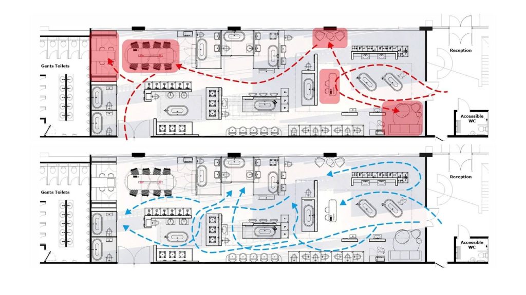
If you sense a bottleneck in your store, or you notice sales are dropping, take a look at how shoppers move through the space.
In store or security footage is a treasure trove of layout data. Simply look out for people skipping whole areas or circling the same zone twice. Remember to make a note every time you spot:
→ Dead zones.
These are the areas people avoid, often because they feel cramped, hidden, or just slightly wrong.
→ Congestion points.
If queues spill into browsing zones, people move on instead of slowing down.
→ Doubling back.
Customers should move forward through the space.
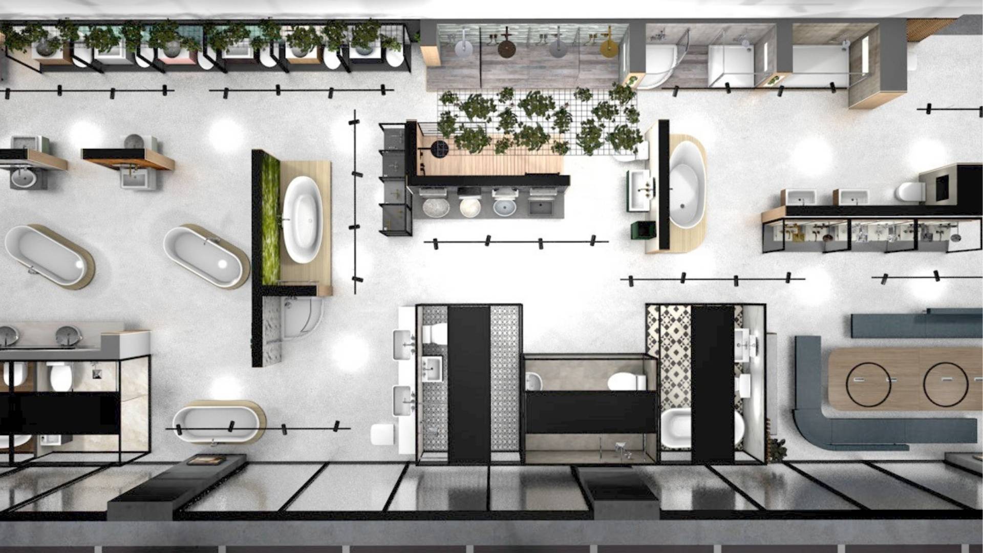
For inspiration atke a look at the BPerfect beauty store below
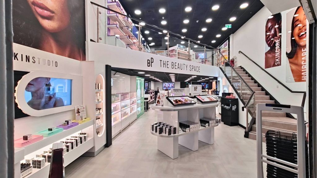
It’s clearly zoned with product testing areas to the right, trending products on entrance and third party brands upstairs. It’s got breathing room for the customer to choose where to go as its decompression zone at the front of the store isn’t cluttered
Ripple Tip: Start with a Simple Planogram
Grab a pen, a floorplan, and your latest sales data.
Map your top sellers. Where are they? Are they easy to spot, or lost in low-traffic corners?
A basic planogram audit can highlight the quick fixes, like rebalancing product zones or rethinking queue placement. But if the layout feels tired or nothing’s shifting, that’s where we come in.
We’ll help you spot the hidden gaps, bring your floorplan back in line with how people actually shop, and give those underperformers a better shot.
Real Layouts, Real Results
Even small changes to layout can unlock big performance shifts, especially when they’re based on how people actually move, choose, and dwell.
JTA Showroom: Fixing Flow to Boost Revenue
In JTA’s Ulverston showroom, the consultation zone sat quietly at the back of the space. It wasn’t always immediately obvious, and some visitors would pass by without realising it was there.[1]
When we came into the store, we moved the consultation zone to the natural entry point. After some additional intuitive signage and products grouped by customer journey, the space began to guide people, not just display to them.
We left them with a confident, intentional store that improved navigation and sales:
→ 29% increase in revenue in two months
→ 14% increase in average basket size over the following year
Retail Space Planning: Sensory Design = Emotional Design
The best store layout influences how shoppers feel, just as much as where they go.
At Ripple, we design with sensory cues in mind: the way a space sounds, the way surfaces respond to touch, even the way scent changes perception.
- Sound: Ambient loops can calm pace and encourage browsing. Harsh acoustics push people out faster.
- Scent: Adds memory and mood. Just one ambient layer can raise dwell time — or subtly steer people through zones.
- Texture: Tables that wobble or flooring that squeaks? Those friction points create low-level stress that shortens visits.
Even queue layout matters. If your checkout bleeds into browsing space, it creates a tension customers will feel and often avoid.
Reprimo: Zoning Through Senses and Sightlines
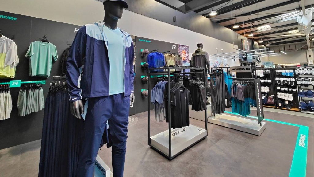
Reprimo entered a multi-brand space with a strong visual identity, but the layout lacked clarity and didn’t support easy engagement.
Our team spotted that too much focus had been placed on front-facing racks, while vertical space remained underused, making it harder for the brand to stand out.
Our design incorporated high-wall displays to elevate the product story, utilised floor markers to define clear zones, and incorporated subtle sensory cues into the customer journey.
These changes helped carve out a distinct identity for Reprimo within a shared space, making the brand feel self-contained and intentional.
With better flow and spatial definition, customers moved more confidently through the range, spent more time browsing, and connected more naturally with the brand.
Design Tactics That (Actually) Work for Retail Space Planning
These are core principles in retail space planning that go far beyond aesthetic appeal, and are included in every Ripple store design:
- Hero tables at entrances – prime spot for launches, but leave room for flow.
- End-of-aisle units – act as signposts and impulse grab zones.
- Interactive displays – create dwell time and invite play.
- Impulse bins near tills – powerful, but use sparingly to avoid clutter.
- Modular shelving – makes layout changes and A/B testing easier.
Want to see how it all comes together? Take a look at our Showroom Design services and our work for Trespass, Dulux, and more.
Or, explore how we support high street brands and trade & DIY environments with spaces that work harder, feel better, and sell more.
Start With a Layout Audit — Then Let’s Talk Customer Flow in Retail Space Planning
Improving your layout doesn’t always mean knocking walls down or starting from scratch.
Store layout psychology is a few smart moves such as regrouping products, adjusting the flow, or tweaking lighting to change how the space feels. That’s often all it takes to shift behaviour.
At Ripple, we work with retail teams to spot what’s holding a space back. Not just in footfall, but in how people feel when they walk in, how long they want to stay, and if they’ll make a purchase.
Need a fresh pair of eyes? Whether it’s a quick layout review or a full redesign, we’d be happy to talk it through.